![](https://wp.coventry.domains/graphicdesignweeklytasks/wp-content/uploads/sites/4945/2023/03/Nespresso_Packaging-1017x1024.png)
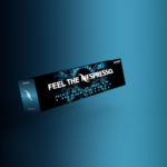
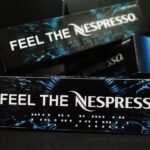
This is the first trial package – Where I was experimenting with the use of coffee gradient color.
![](https://wp.coventry.domains/graphicdesignweeklytasks/wp-content/uploads/sites/4945/2023/03/Nespresso_Packaging02-1017x1024.png)
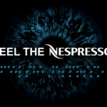
I wanted to create an illustration that would speak a World Sight Day Awareness. So, I did some sketches and experimented with Illustrator. Finally, came up with the circle pattern that describes the human eye by using a color gradient (brand guideline keeping in mind).
![](https://wp.coventry.domains/graphicdesignweeklytasks/wp-content/uploads/sites/4945/2023/03/Nespresso_Packaging01-1017x1024.png)
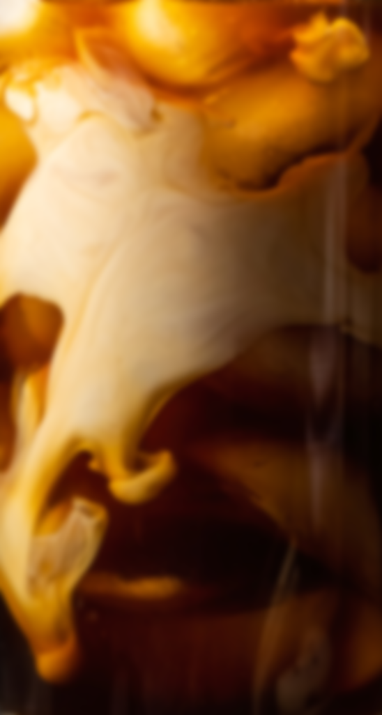
I was searching for the coffee images. However, I ended up with coffee with a milk effect. To be honest, it genuinely blends with the Nespresso logo and it gives a visually impactful. The image I placed was luckily downloadable.
![](https://wp.coventry.domains/graphicdesignweeklytasks/wp-content/uploads/sites/4945/2023/03/pexels-skyler-ewing-10540639-683x1024.jpg)
![](https://wp.coventry.domains/graphicdesignweeklytasks/wp-content/uploads/sites/4945/2023/03/Nespresso-Package-548x1024.png)
![](https://wp.coventry.domains/graphicdesignweeklytasks/wp-content/uploads/sites/4945/2023/03/Nespresso_Package-02-1024x724.png)