Feel the Nespresso – Typeface and Color Selection
Selecting the Arial Typeface is visually acceptable for my audience (Visually Impaired). Arial font is an accessible Sans Serif, and…
Selecting the Arial Typeface is visually acceptable for my audience (Visually Impaired). Arial font is an accessible Sans Serif, and…
https://miro.com/welcomeonboard/MUlXYjczc29odlpBVUt5aW15UTRMSVdzQ1V4bFJkM1ZidzlyRjFyalpZWkxvMUlmUXZXTTZsNVhpaG5SNjVleHwzNDU4NzY0NTQ1MjAxODY3MTg3fDI=?share_link_id=772622406707

The process started with a sketch, and then I transferred it to Illustrator to create a package layout. I have…

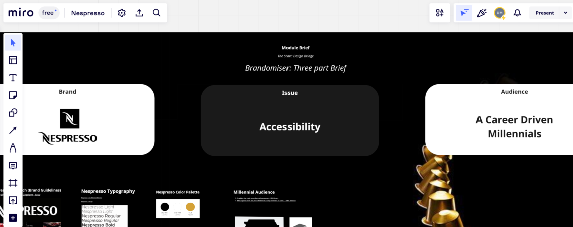
The report is for 7017AAD Graphic Design Specialism Module. In this report, I will investigate the current issues for Accessibility…

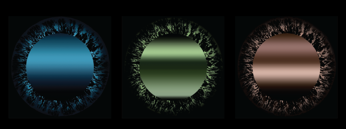
Initially, I had created an eye sketch that later. I will transfer to Photoshop to refine the edges. However, It…
Aim To make life easier for Visual Impaired people through experiencing Tactile packaging. Objective Experience the tactile Nespresso packaging. Concept…
I need to change the packaging by adding the ‘Feel The Nespresso’ in bold font with an Eye shape pattern….