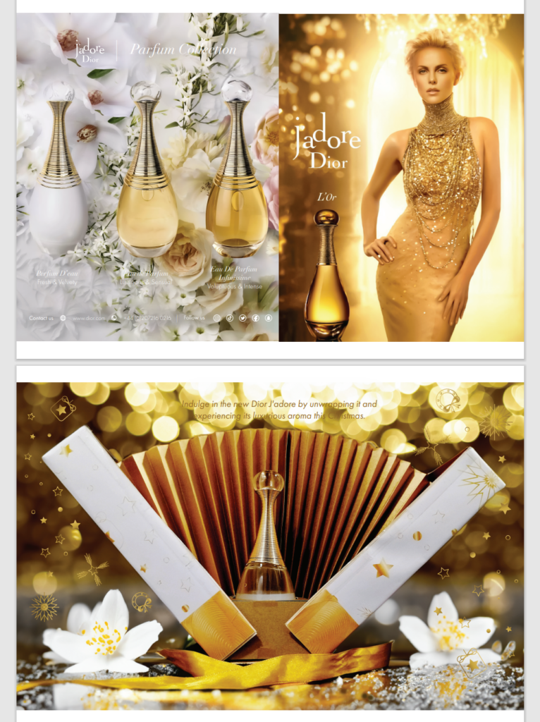
I was involved in a Perfume Packaging project centered on Dior J’adore, an already-existing perfume created by Christian Dior. The perfume is a symbol of timeless elegance and is associated with the gold choker necklace of the queen of Masai. The packaging for Dior J’adore incorporates various visual elements such as metallic, patterns, and embossing to enhance its sophistication.
The primary objective of the project was to maintain design consistency in the packaging to enhance brand appeal and create a positive impression on consumers, thereby improving the brand’s image through attractive packaging. To achieve this goal, I sought to align the brand’s personality by creating aesthetics and consistency through distinctive concepts, taking inspiration from other designers, and experimenting with prototyping the functionality.
During my research, I discovered that people value luxury and quality products that stand out and appreciate special editions or limited editions. Therefore, I aimed to incorporate these elements into the packaging design to create a unique and luxurious appearance that stands out and appeals to consumers.
My Design Problem
I find the packaging of J’adore unappealing as it takes away as it distracts from the product’s essence. How can I design a package that enhances the user experience without compromising functionality?
Creative Brief
Brand Personality – The brand portrays beauty that radiates confidence and sophistication.


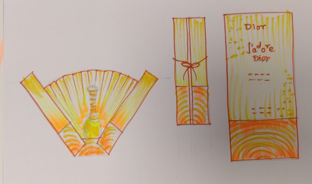
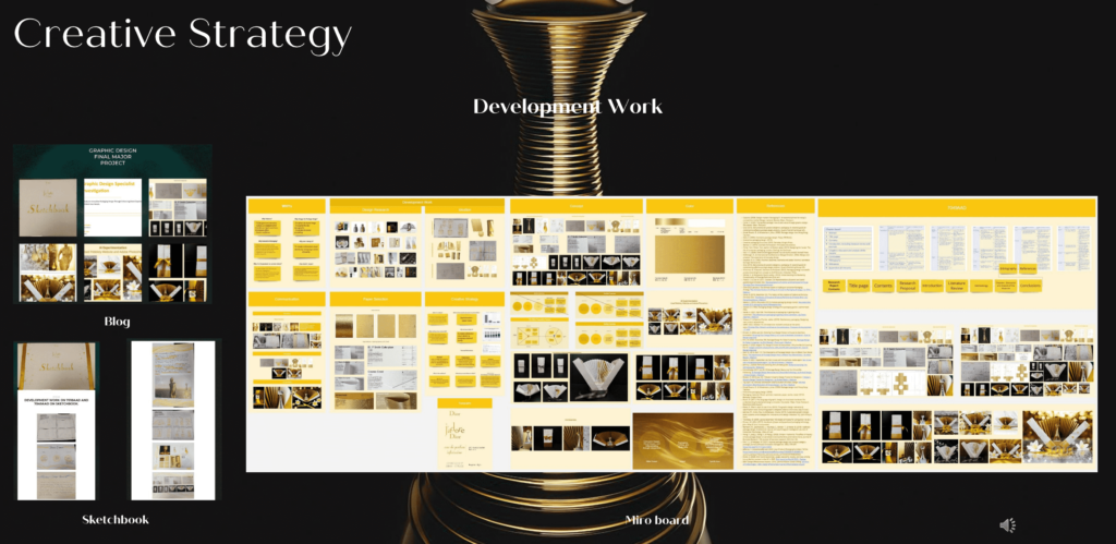
As a designer, I created sketches for packaging by studying the measurements. I organized my work using MiroBoard, updated drafts on WordPress Blog, and conducted physical experiments with the packaging to achieve precise results.
What do you want them (the audience) to think?
The purpose is to enhance the perception of exclusivity and elegance through innovative packaging.
Why should they buy J’adore? / What will they get from the experience?
This brand of perfume is widely known for its elegant feel.
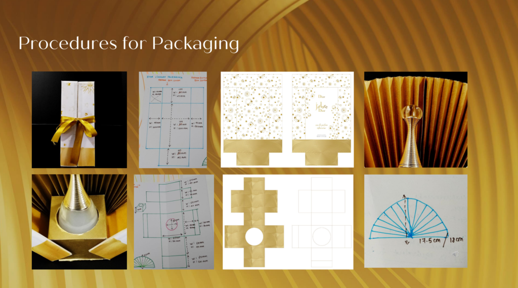
Procedures for packaging
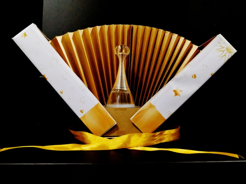
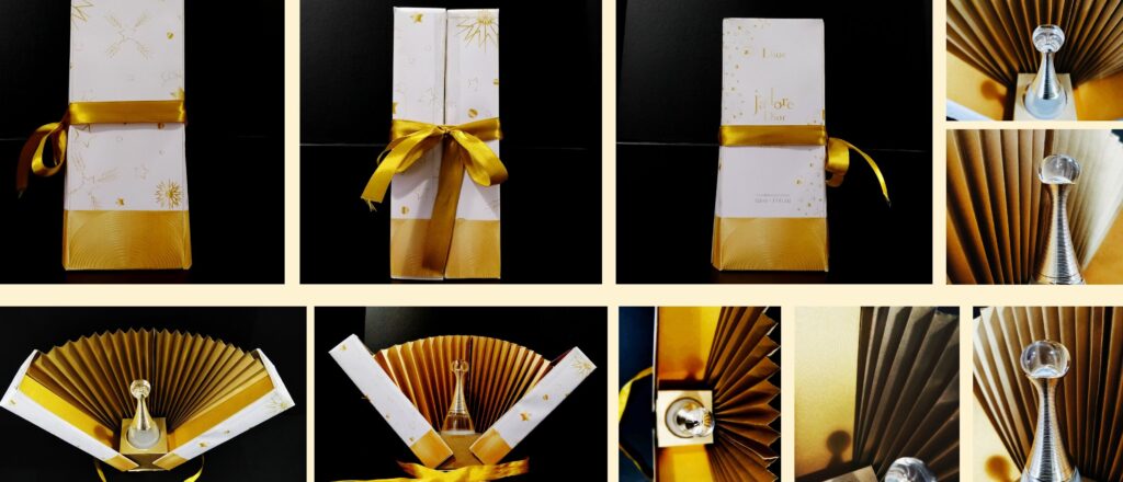
Let me give you an insight into the Package functionality.
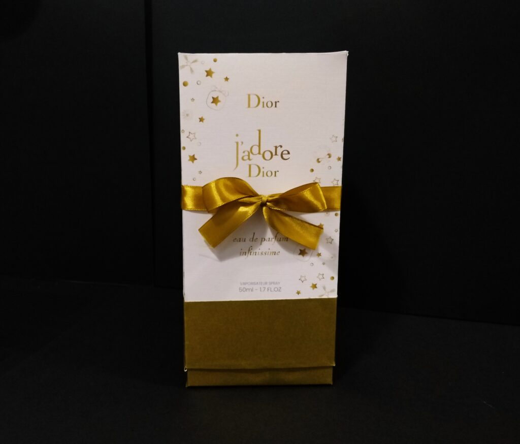
I have decided to go with two half boxes with accurate measurements. For an exemplary amount of paper grammage, I have ordered G.F Smith sample papers in A3 size.
For the exterior part of the boxes – I have printed them out in A3 size with the fine line texture.

For the interior of the boxes – I have added G.F Smith Gold paper in A4 size.
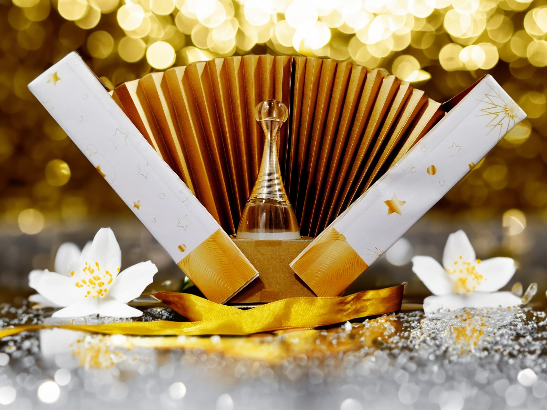
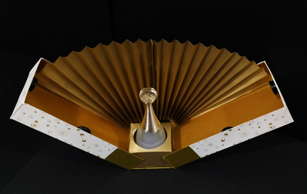
To achieve the peacock effect, I purchased 90gsm gold paper from Amazon and folded it around 1.4cm. The purpose of the measurement was to ensure that the piece would not overlap when closing the box.
The purpose of the peacock effect is to elevate the overall product experience and create a memorable impression.
To make a sturdy box for a perfume bottle holder, I opted for G.F Smith Gold paper of 310gsm. The base measures 17.5cm after cropping.

Overarching concept
My main idea for enhancing a brand is to improve the physical packaging and broaden the target audience through unique packaging.
Product Photography
I found inspiration for my product photography from an artist named Sebastien Jefferies on TikTok. He takes photos of products and shares them on an AI website that offers customization options for the background images based on different themes. For a preferred result, I used the Pebblely AI website to create product photos that fit my desired theme designs. I used Adobe Photoshop, which has an AI – Generative fill option where editors add the selected subject areas and type the preferred images to demonstrate.