My University Experience, Practice, Works and Portfolios

Category: Reflection pieces

My Reflection on the Group Capitalism Project

Individual reflection - 500 words on your group process/choices, rationale/context, and how your photos fit into the overarching narrative/theme and the individual contribution you made to support the group project outcomes.

A PDF Version: 280mapa reflection.pdf

The Reflection:

Within this project we had come up with a range of ideas that we could do for this project and investigated what would both challenge us and show off a unique outlook of what the essay will entail. So, with the artist statement we chose ‘Capitalism is acknowledged but only at a surface level’ and we chose this topic as its such a large subject that can be difficult to portray to those who don’t think about capitalism within their everyday lives. This allowed us to look at places and things around the city that would be connected to capitalism and take picture of the everyday shops, places and industries that work within this capitalist system.

As people are aware of capitalism but not how vast and impactful, we wanted to make our images to demonstrate places that normal people go to but have a caption that demonstrates how each of these play into roles of a capitalist society. I think we managed to communicate our ideas with one another and work towards this goal, we could have worked better when it came down to time management however due to the short amount of time we had as a group I think that we managed to communicate each how we would portray each step with one another efficiently.

Our group started off being unsure how we would tackle this project, however once we had come up with this theme, we communicated who in our team would portray which elements of the theme. The elements that I would portray would be industries and places that include the theme. This would link as they are all tied to Capitalism within our everyday lives. With the five photos I took I managed to capture environments and landscapes of parts of the city that have been built around capitalism and I connected them all together through the use of the caption which explains how these building have either used capitalism within their company or gained profit from it. Along with this we split the artist statement essay into five so we would each have to write about it and put out a reference which was an effective idea in working with each other by continue an essay from one person to the next. Despite some moments where we didn’t communicate enough, I believe we manged to show off a successful photo essay. However, if we were to do this again, I think we could narrow the theme down further and maybe make more of a story narrative or creative native with the images. The main improvement that I would make when doing this project would be to try and make the overall images link more as without the captions to link them, they would not have a clear enough link.

 The overall photo essay was a completely different style of essay to what I’ve done before, and even though they’re aspects that could be improved, I think that we managed to create some successful images for the essay.

Picture Essay

Capitalism is acknowledged only on a surface level

Our Photo Essay:

Photo essay – Google Slides

The Photo Essay: All The photos and Captions (and credits):

(Credit To: Freya Glenton – IMG_20220323_151130.jpg)

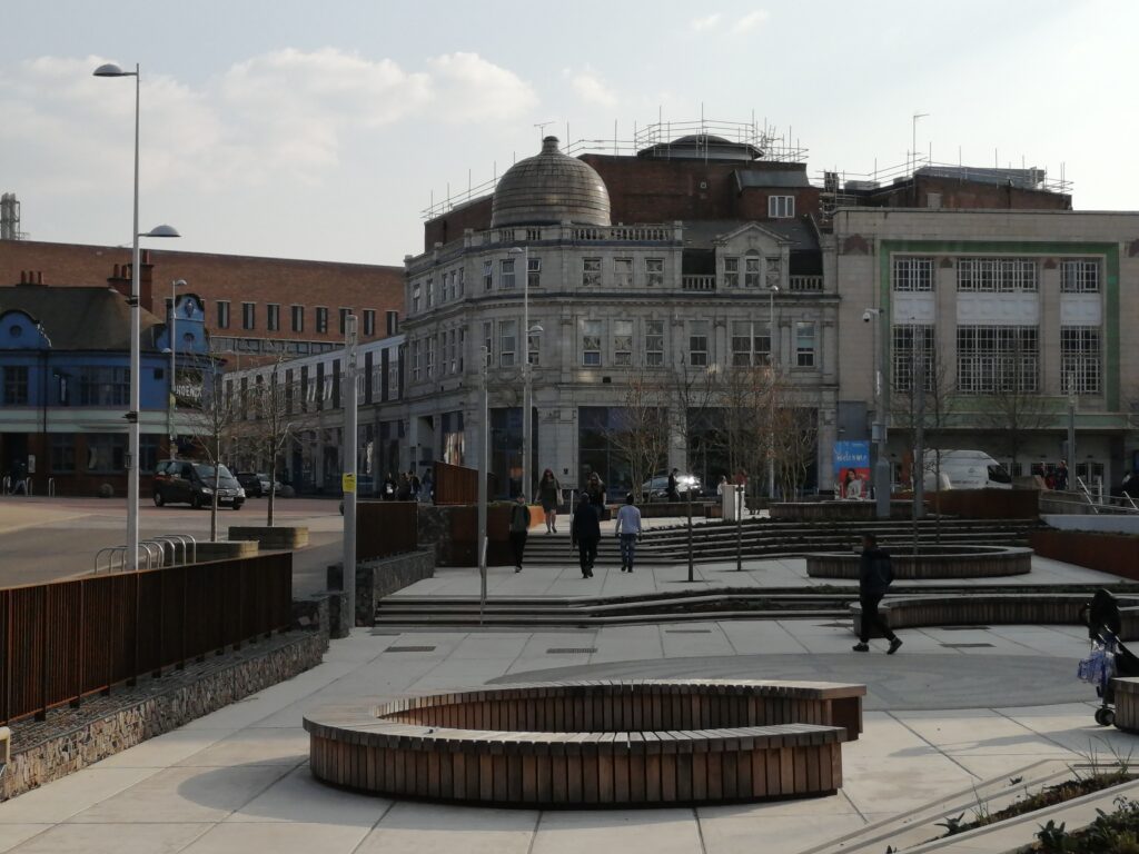
New city center, at what cost? With citizens paying out for the large expense. 

(Credit To: Freya Glenton – IMG_20220323_154049.jpg)

Young people going into debt for education and housing.

(Credit to: Freya Glenton – IMG_20220325_114224.jpg)

Church of England receives around £400m from their religious congregation.

(Credit To: Freya Glenton – IMG_20220323_151216.jpg)

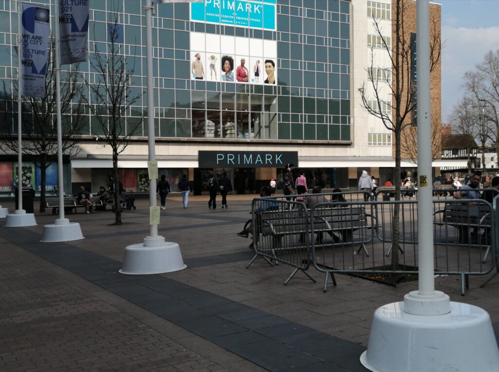
Companies, such as Primark, make Billions through their consumers and underpaying factory workers. Underpaid workers as dying due to these fast fashion industries.

(Credit To: Freya Glenton – IMG_20220323_151658.jpg)

£11 for 1 skirt within shops like Primark that are part of the fast fashion industry that exploit garment factors that earn no more than £80 a month.

(Credit To: Beatrice – beatrices 280 1.jpg)

Users pay by their time

(Credit To: Beatrice – beatrice 2.jpg)

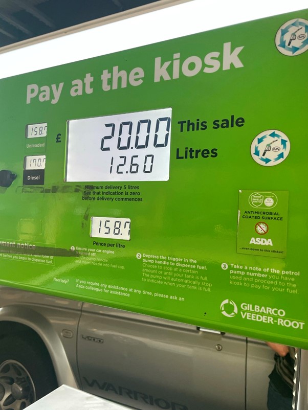
Fans make them wealthy

(Credit To: Beatrice – beatrice 5.jpg)

While coffee in Ethiopia costs 0.2£, Starbucks charges 3.5£.

(Credit To: Beatrice – beatrice 4.jpg)

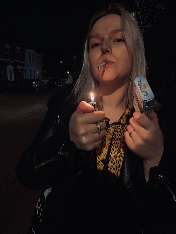
The tobacco industry is enormously profitable, however, what is the actual cost?

(Credit To: Beatrice – beatrice 3.jpg)

Some people suffered, others made a lot money.

(Credit to Ade – Ade 1.jpg)

The disposable vape industry has exploded as of recent with companies making millions but the cost seems to be increased pollution, health issues  and more children with nicotine addictions

(Credit to Ade – ade 5.jpg)

This picture represent how industries hoard products that many people need in their lives, despite the products not being in use. You can see this in the food industry where food is thrown away or here where the laptops are kept exclusively for university students

(Credit to Ade – ade 3.jpg)

Apple is a prime example of pricing based on status rather than material value. This is a standard in consumerism but when companies present their products as a status symbol it allows them to charge exorbitantly for their products

(Credit to Ade – ade 2.jpg)

The luxury car industry is exploitative of their workers. The prices for these cars are exorbitant compared to the labour and what these labourers earn. Many of these cars are valuable because of the status they show the owner has rather material value.

(Credit to Ade – ade 4.jpg)

Luxury brands extremely exorbitant in nature when it comes to pricing. The fashion industry is exploitative, making use of cheap labour then charging hundreds or  thousands for the products made for fractions of that amount

(Credit to: Vera – vera 1.jpg)

They “say” something; the advertisement says another thing.
Your bad habits feed their pockets.

(Credit to: Vera – vera 2.jpg)

“They see discounts and donating as a way to devalue their brand.”

(Credit to: Vera – vera 3.jpg)

“What matters most is the comfort of the community”
But, how much does it cost your comfort?

(Credit to Vera – vera 4.jpg)

This application is more suitable for Apple’s Dispositive

*Manipulated campaigns that limit people’s choice

(Credit To: Vera – Vera 5.jpg)

“Vape is better for your health, and it’s allowed to smoke in many places!” To don’t stop the movement of capital, everything is allowed

(Credit To: Zainab – Zay 4.jpg)

Increase in NI tax to cover nhs, health and social care.

But, what improvements have actually been made?

(Credit To: Zainab – Zay 3.jpg)

‘There is more emphasis to own expensive items i.e, luxury watches or perfume than the quality of environment we live in.’

(Credit To: Zainab – Zay 2.jpg)

Increase in cost of living i.e petrol prices, but wages have remained the same.

(Credit To: Zainab – Zay 1.jpg)

The exploitation of individuals who operate Amazon’s global infrastructure is what maintains it together.

(Credit To: Zainab – Zay 5.jpg)

The Royal family is an economic powerhouse, yet they don’t actually have political influence.

Our Team/Group:

Freya Glenton (Me)

Beatrice Bergaudaite

Contact her here:

Ademide Liam Banjoko

Contact Them Here:

Vera Lucia Agostinho Nascimento Moniz

Contact her here:

Zainab Adisa

Contact her here:

Adobe Game Cover Presentation & Reflection

Sticky Post

My Presentation:

Presentation – Freya.pptx

Reflection on My Video Game Cover Design:

Adobe 500word evaluation analysis:

Within my product I decided on creating a game cover and I experimented with different genres I could create along with different games I could take inspiration from. So, I ended up choosing to create a game within the horror sci-fi genre. Aspects that I want to focus on is the visual conventions that are within the genres that I could include within my cover. Some examples conventions I could investigate are colours, blood, planets, robots, etc. Along with using these conventions I’ve researched vector artists that create art in illustrator that inspired my design.

After researching different artists and finding out design elements that I find eye-catching I decided to implement them into my design. Elements that I found interesting was the limited colours schemes and the glowing effects. So, to do this I will use horror convention colours and create these effects the best I can.

As I only have limited skills so far within illustrator I wanted to try and include a lot of the skills that I have learnt such as using opacity, shapes and vector anchors using the pen tool. When designing the cover I used a lot of reds and darker shades to create this dark atmospheric look to the cover and I designed a lot of villainous monster designs to fit the horror genre which will appease the target audience and as well as that I made the cover include cryptic designs for the artificial intelligence parts making a glowing effect using blurs and gradients making different transparency’s and shades within the design to give off a robotic feel to the piece this would catch the target audiences attention due to the fact that I am targeting teens and consumers of the sci-fi and horror genre. Along with this within the design I decided to reference other main horror character designs through making my character wear a yellow jack which is a slight intertext reference to games such as Little Nightmares I/II or films like ITchaper1.

After designing the character and backgrounds to include elements such as planets, robots and other elements I made sure to add game conventions such as the company who made the game, PlayStation, along with a game developer, naughtydoggames, along with that I included a barcode, rating and scenes within the game.

Once I did this I made sure to add a title that I stylised to fit the sci-fi genre by making the title have a slight glitch effect to it using reds and blues on the front cover but using red on the spine. I made it still readable so the audience can easily see what the name of the game would be. I made the title give some mystery to the game.

One of the main improvements or changes I could have done would’ve been to include more horror conventions as I didn’t make it really clear as to which game genre it would be. I could’ve made the genre slightly clearer for the audience.

Short Reflection and Analyse of Steven Kings IT’s Trailer

Assignment Task: 
Students will need to choose an appropriate media artefact, research its origins and purpose and write a 500-word response, critically reflecting the appropriateness, successes and failings of the selected artefact. [500 words]

Solo Reflection on IT’s trailer:

Warner Bros. Pictures. (2017). IT – Official Teaser Trailer. YouTube. https://www.youtube.com/watch?v=FnCdOQsX5kc

Steven Kings ‘IT’ trailer created to entice the target audience, which for this film the target would be horror fans and young adults from the age of around 15-20, into going to watch the film IT. The trailer does a fantastic job of capturing the audience’s attention straight away as it immediately starts building tension through the eerie music.

The trailer has a slow build up to horror tropes to not reveal to the audience the entire plot making this an effective trailer as shows off some striking scenery and horror conventions to entice the audience into seeing the entire film. An example of this right from the start of the trailer producer has used conventions such as colour and non-diegetic music to build up the tension of the beginning of the trailer immediately attracting the target audience’s attention.

The director laid this trailer out in a suspenseful way that allowed the audience, who watch for entertainment value, to get hooked while the trailer drops hints of what’s going to happen coming up in following scenes. As the beginning of the trailer starts of light with just dark colours, close up shots and tense music to hint to the audience that something is going to happen and this continues to build the tension within the trailer as the character of Georgie goes outside and we begin to gain some diegetic sounds such as rain and thunder along with the character wearing a yellow raincoat, yellow often being used as to make the audience subconsciously feel tense as it indicates as a warning or danger towards this character, with the camera tracking and following Georgie switching from a birds eye long shot to a close up mid shot allows the audience to feel as though they are following Georgie creating a suspenseful atmosphere.

The trailer continues this throughout using colour as a strong signifier to the audience to indicate danger the main example of this is the red balloon that appears almost throughout the trailer and along with this the (non-diegetic) music picks up and fades and picks up again creating this sinister feeling for the audience. Along with this the trailer although shows off a hints of clown that is the main part to this film the audience does not get to see the full experience of chilling experience which would allure the audience into going to experience this film.

Along with this the trailer plays a lot on horror conventions as it uses a lot of suspenseful music, a creepy child and a murderous clown which are some typical horror tropes that are seen within the genre but is also a major part of attracting the indented audience as these are elements that make the trailer terrifying making the audience attracted to go and see the whole product, along with this they used the sinister slogan ‘you’ll float too’ and also mentioned the famous Steven King which would draw the audience in more making this an affective and enticeful trailer.

References:

Fairbrother, H. ( 2015 ). 2 Audience Theory – Media Studies. Mrshollyenglish.Com. http://media-studies.mrshollyenglish.com/theory/audiences-institutions/audience-theory

A website that informs about: Audience theory, Hypodermic Needle Theory, Uses and gratification (Blumler and Katz) and codes and conventions.

Extra Information:

Within the future when I develop my skills in analysis further I will come back to this trailer, or to the film as a whole, and re-analysis it as an actual analysis and not just a reflection.

This will be done here:

Protected: Reflection Video (and introduction to website video)

This content is password protected. To view it please enter your password below:

Protected: Horror Movie Poster

This content is password protected. To view it please enter your password below:

Protected: (1 minute at home concept) My teaser trailer:

This content is password protected. To view it please enter your password below:

Powered by WordPress & Theme by Anders Norén

This website was created using Coventry.Domains, a service of the Coventry University Group. The information, views, opinions and discussion contained on this website are those of the author(s) and do not necessarily reflect the views and opinions of the Coventry University Group. For more information on privacy, cookies, takedown requests and more, visit our policies page.